Connecting and communicating are what we do in business. Best to do them effectively! Just think: you might be the world’s best maker of popsicles, but if you want to sell them to Laplanders or raise venture capital for your popsicle start-up, you might discover that communicating the why and what-for of popsicles is pretty darn difficult.
Talking about numbers is a major challenge for people working in AFC (administration, finance and control) and for those in ICT (information, communication and technology). The line between the two gets progressively less clear every day and they continue expanding towards other disciplines. Hence the need to explain data simply and succinctly.
When you need to tell stories using data, there are some simple rules to follow:
Limit your presentation to a single main theme, or a few ideas that are closely linked with a very detailed structure.
Illustrate delicate questions carefully, keeping in mind that the narrative works better if the plot is unraveled in a linear, logical fashion. For example, understanding why sales have been decreasing since the first quarter is more important than seeing it represented in a graph.
Adapt your presentation to the mood of your listeners. I know it seems a bit bizarre, but if you discover that your listeners are particularly stressed out about something, you might forego that slide full of complex data and opt for a smile-inducing punchline instead. Neutral pre-meeting small talk is also a good way to get a feel for the room’s predisposition.
Logically, you have to talk about figures and the processes that lead to those numbers, but I suggest you never talk about specific people (unless it is absolutely necessary). People naturally get defensive and stop listening. Data are neutral and can express situations: a discussion about who brought about those situations should be the subject of further, non-public analysis.
Data tell us what happens—the stories that produce those data explain the why. On the other hand, we explain the data with stories that explain why it is important to know those numbers! Returning to the example of the sales graph: is it true that historically most yearly sales take place in the first quarter? Or is this the first time and you have to figure out why? Help listeners reason through the questions the data evoke and don’t leave the conclusions to chance.
What types of charts to use?
No doubt that numbers are better understood if we express them clearly in graphs rather than complex tables. But which graph types are the most effective? That depends on the type of information you need to convey and on your audience. Generally, it’s a good idea to avoid pie charts if differences are hard to discern between the slices. Here’s a pie chart about sales:
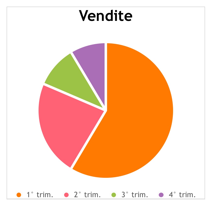
The green and purple sections do not present a significant difference. In the following version, labels clarify the difference between 8% and 10%.
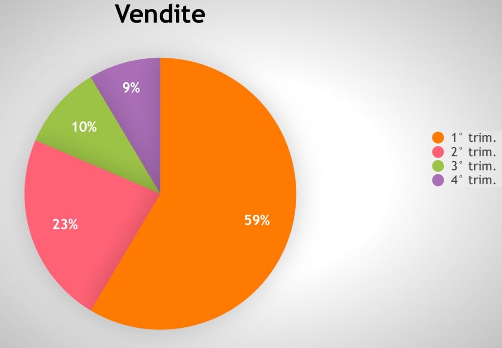
Imagine the effect if you projected this graph:
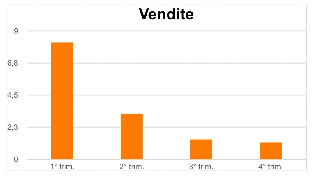
Not to mention this one, which would cast a very depressing shadow on your meeting:
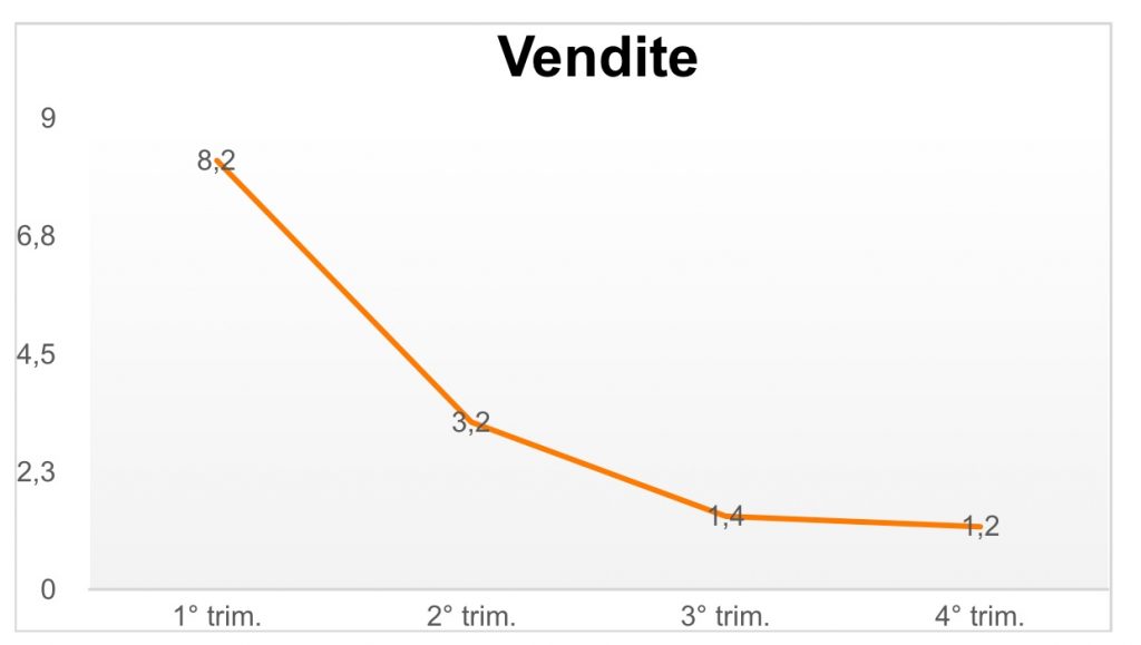
If that is your objective – great. Otherwise, pick a graph that is more appropriate to your message.
Clearly, you have to communicate numbers if that is your goal, but knowing how to communicate them in the best possible way will help your listeners understand what’s behind the numbers. Based on that knowledge, you can make your call to action.
And calling your listeners to action, giving them something to do with their new understanding is a great way to conclude every business presentation.
-Fatima Carbonara (April 2019)
